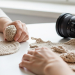
Introduction
Have you ever finished a crochet or knit project—only to realize the colors clash more than they complement? You’re not alone. Many crafters choose yarn based on what “looks pretty” in the store, only to be disappointed when those hues don’t harmonize in stitches.
But what if you could confidently select color combinations that sing, whether you’re making a bold granny square blanket or a subtle gradient shawl? The secret lies in yarn color theory—a simple, visual approach to pairing colors that creates balance, depth, and wow factor.
In this guide, you’ll learn how to apply the basics of color theory to your fiber projects—no art degree required! We’ll break down the color wheel, explore tried-and-true palette formulas, and share real-world tips for testing combinations before you commit. You’ll also discover how lighting, fiber type, and even your mood can influence how colors “read” in yarn.
By the end, you’ll feel empowered to choose palettes that not only pop—but tell a story, evoke emotion, and make your handmade pieces truly unforgettable. So grab your yarn stash, and let’s paint with thread!
The Color Wheel: Your Secret Weapon for Harmonious Palettes
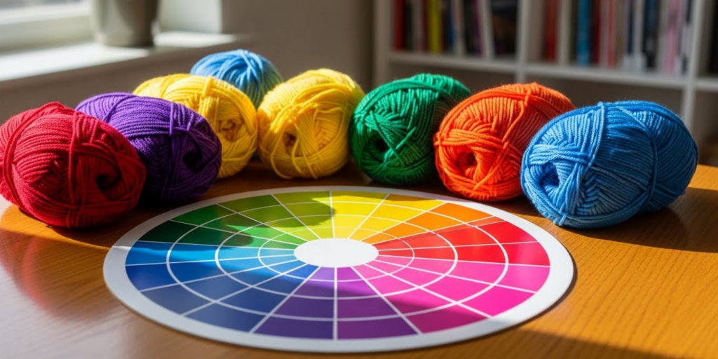
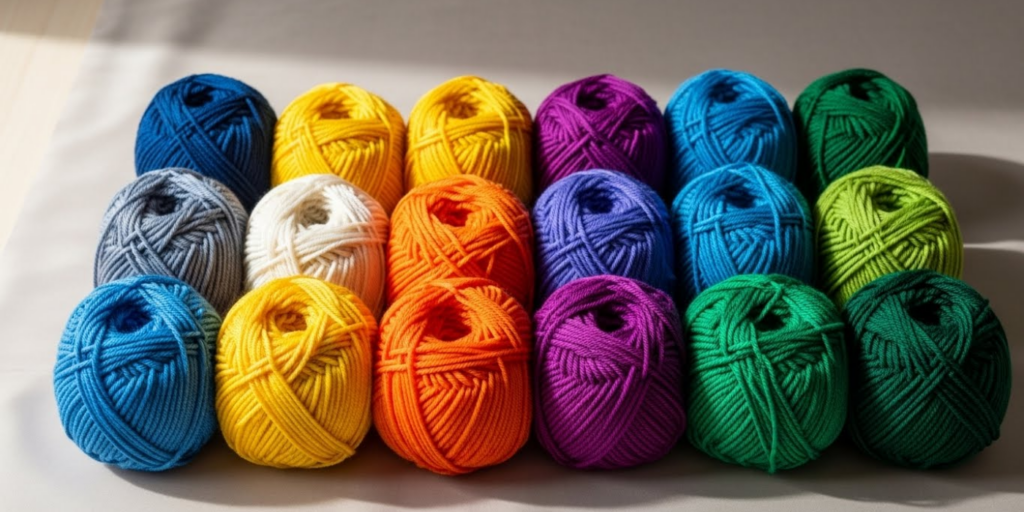
Believe it or not, the same color wheel artists use in painting applies beautifully to yarn. At its core, it’s a circle of 12 hues based on three primary colors: red, blue, and yellow. Mix those, and you get secondary colors (green, orange, purple). Add tints and shades, and you’ve got an entire universe of options.
But you don’t need to memorize it—just understand a few key relationships:
- Complementary colors sit opposite each other (e.g., blue and orange). They create high contrast and energy—perfect for bold designs like market bags or statement blankets.
- Analogous colors sit next to each other (e.g., blue, blue-green, green). They offer harmony and flow—ideal for soothing shawls or baby clothes.
- Triadic colors form a triangle on the wheel (e.g., red, yellow, blue). They’re vibrant but balanced—great for playful amigurumi or granny squares.
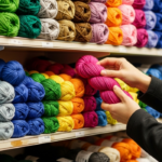
Pro tip: Most yarn brands now label their color numbers. Use apps like Adobe Color or Coolors to input those numbers and see how they interact on a digital color wheel.
And remember: yarn isn’t paint. Texture, sheen, and fiber content change how color appears. A matte cotton in “sage green” may look totally different next to a shiny silk in the same name. Always swatch together!
Five Foolproof Yarn Color Palettes (And When to Use Them)
Instead of guessing, try one of these proven combinations. Each works across skill levels and project types:
- Monochromatic Magic
Use varying shades of one hue (e.g., ivory, oatmeal, espresso). Creates elegance and depth without overwhelming the eye. Perfect for: scarves, sweaters, minimalist home decor. - Earthy Neutrals + One Pop
Combine warm beiges, taupes, and browns with a single accent—like rust, olive, or mustard. Grounded yet dynamic. Perfect for: blankets, baskets, unisex accessories. - Jewel Tones
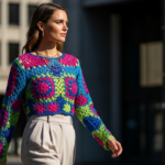
Think emerald, sapphire, amethyst, ruby. Rich, saturated colors that glow against each other. Perfect for: winter cowls, holiday gifts, evening wraps. - Pastel Dream
Soft lavender, mint, blush, and sky blue. Gentle and nostalgic. Perfect for: baby blankets, spring cardigans, nursery decor. - High-Contrast Complements
Navy + coral, teal + peach, purple + gold. Bold and modern. Perfect for: tote bags, pillow covers, statement hats.
Real-world example: A crocheter used a triadic palette of mustard, teal, and burgundy for a hexagon blanket. Instead of looking chaotic, the shared earthy undertones unified the look—proving that undertones matter as much as hue.
The Hidden Factors That Change How Yarn Colors “Read”
Even the best palette can fall flat if you ignore these subtle influencers:
- Lighting: Natural daylight shows true color. Incandescent bulbs warm it up; fluorescent lights cool it down. Always check your yarn near a window!
- Fiber content: Silk reflects light (making colors brighter); wool absorbs it (softening intensity); acrylic can look flat or artificial.
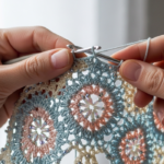
- Stitch texture: Cables, bobbles, or lace create shadows that mute or deepen color. A bright pink may look dusty in a dense stitch but vibrant in openwork.
- Your background: A white wall vs. a dark sofa changes how your finished piece appears. Consider where it’ll live!
Try this: Lay your chosen yarns on different surfaces—wood, white paper, denim—and observe how they shift. You might be surprised!
Also, beware of “dye lots.” Even within the same color number, batches can vary. Buy all skeins at once, or alternate every two rows to blend differences.
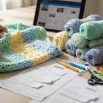
How to Test Your Palette Before You Commit
Don’t wait until Row 50 to realize your colors fight. Use these low-risk strategies:
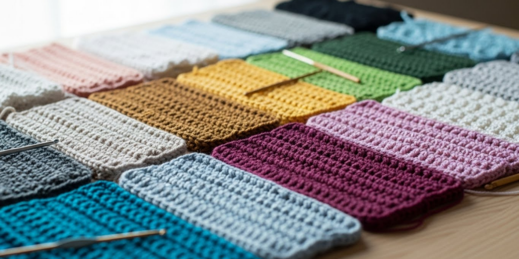
- Make a Mini Swatch Blanket
Crochet a tiny version (4″x4″) using your full palette in the intended stitch pattern. See how the colors interact in 3D. - Photograph & Desaturate
Take a photo of your yarns together, then convert it to grayscale. If the values (lightness/darkness) are too similar, the design may look flat. You want contrast in tone as well as hue. - Use the “Thumb Test”
Wrap strands around your thumb side by side. Step back 6 feet. Do they blend into a pleasing whole—or a muddy mess? - Ask a Friend (Who’s Not a Crafter)
Crafters often overthink. A fresh eye can say, “That orange totally overpowers the gray!”—saving you hours of frogging.
Bonus: Many indie dyers offer “mini skein sets” or “gradient kits” pre-curated for harmony. These are fantastic for learning what works.
Why Great Color Choices Elevate Your Craft (and Confidence)
Using intentional color doesn’t just make your project look better—it changes how you feel about your work. When your palette sings, you’re more likely to:
- Wear or display your piece proudly
- Share it online with confidence
- Feel inspired to tackle more complex designs
Color also communicates mood. A deep indigo and silver shawl feels serene; a hot pink and lime coaster feels playful. You’re not just making objects—you’re creating emotional experiences.
One knitter shared that after learning color theory, she finally understood why her “random rainbow” blanket felt chaotic. She reworked it using analogous blues and greens—and called it “Ocean Breath.” “Now it hangs in my living room,” she said. “It calms me every time I see it.”
Your color choices are part of your creative voice. The more you practice, the more distinct—and confident—that voice becomes.
Practical Tips for Building a Versatile Yarn Color Library
Don’t feel pressured to buy every color. Build a core stash of versatile hues that mix and match:
- Neutrals: Cream, warm gray, charcoal, chocolate brown
- Earth tones: Olive, terracotta, mustard, dusty rose
- Jewel accents: Emerald, cobalt, plum (use sparingly)
Store them in clear bins labeled by undertone (cool vs. warm). When you find a new color you love, ask: “What neutrals will I pair this with?”
Also consider “workhorse” variegated yarns—those with subtle shifts (like ombre or tonal dyed skeins). They add interest without requiring multiple solid colors.
And remember: less is often more. A two-color project with perfect harmony beats a five-color mess every time.
From Theory to Thread: Your Color Journey Starts Now
Color theory isn’t about rigid rules—it’s about developing your eye and trusting your intuition. The more you observe how colors interact in nature, fashion, and art, the more naturally you’ll choose palettes that feel “right.”
Start small. Pick one tip from this guide—maybe the grayscale photo test or the thumb method—and try it on your next project. Notice what works. Celebrate what surprises you.
Because in the end, yarn color theory isn’t just about making things look good. It’s about making things that feel true—to your style, your space, and your soul.
Conclusion
Choosing yarn colors doesn’t have to be guesswork. With a little knowledge of the color wheel, awareness of lighting and fiber effects, and a few simple testing tricks, you can create palettes that are balanced, bold, or beautifully subtle—exactly as you envision.
We’ve explored how complementary, analogous, and triadic schemes work; reviewed five go-to combinations; and shared real strategies to preview your palette before you stitch. Most importantly, we’ve seen how intentional color choices can transform not just your projects—but your creative confidence.
So the next time you’re standing in a yarn shop (or scrolling online), pause. Breathe. Ask yourself: What mood do I want to create? What story should these colors tell?
Then trust your growing instinct. Your hook is ready—and so is your eye for color.
Now, we’d love to hear from you: What’s your favorite color combo to work with—and what project did it bring to life? Share your palette in the comments below! And if this guide helped you see yarn in a new light, pass it along to a fellow maker who’s ready to make their colors pop. Happy stitching!

Gabriela Ferreira is a passionate crochet and knitting enthusiast who finds inspiration in every skein of yarn she touches. With a love for color, texture, and handmade detail, she brings creativity and warmth to each project she creates. Gabriela believes that every stitch tells a story, and she enjoys sharing her craft with others who appreciate the beauty of fiber arts.